


How to make an HTML footer
How to make an HTML footer that sticks to the bottom of the window as it should!
Posted:
November 20, 2021
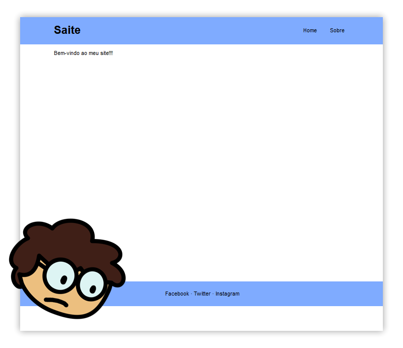
If you've ever tried to make a website using HTML you must have encountered this problem: you make a nice header and a footer, and then THIS happens:
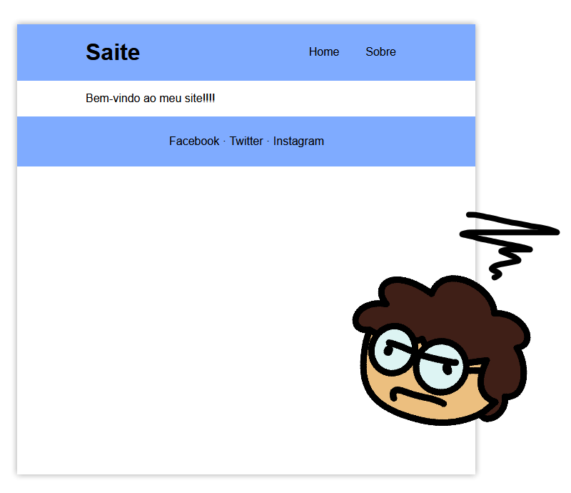
Your website can't reach the bottom of the window and the footer is floating.
I'll use this barebones website for the tutorial: https://codepen.io/fupicat/pen/QWMPjJr - Click the link to follow along!!!
The first thing I tried to fix this was just to specify a minimum height for the section element. I'm gonna use the size measure vh to tell it the percentage of screen height that I want the page to be:
section {
  margin: 0rem 6rem;
  min-height: 73.5vh;
}
(to find the exact value of 73.5% I just kept testing larger values until I could make the scroll bar disappear)
That worked, but there's one problem: it only works on my screen size. If I zoom out, the scroll bar appears again. Someone with a larger screen would still see my footer floating a little bit, which is completely unacceptable.
Therefore, a more elegant and practical way to solve this problem is to use a flexbox - a resizable box that automatically distributes the elements inside it according to its own size. I am going to turn the entire body of the document into a flexbox and change its height to 100vh so that it occupies 100% of the screen height:
body {
  display: flex;
  flex-direction: column;
  height: 100vh;
}
Now I'll just check the styles of the section element and change its height to 100%. This will cause the page to expand and take up as much space as possible in the flexbox, while respecting the header and footer's own space:
section {
  margin: 0rem 6rem;
  height: 100%;
}
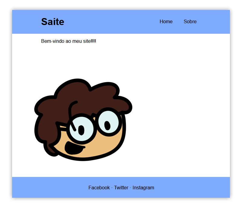
That's it! Now you can zoom in and out as much as you want, add any content to the page, and the footer will still stick to the bottom of the window.
The final CSS you need looks like this (change section to whatever element you want to expand):
body {
  display: flex;
  flex-direction: column;
  height: 100vh;
}

section {
  margin: 0rem 6rem;
  height: 100%;
}
See the complete project in action here: https://codepen.io/fupicat/pen/rNzbNxr